Geeking Spring
I love graphs. (I am a nerd.) I love Spring. (I am a romantic nerd.) Nerds and Spring go together. (The root of the Latin word for Spring is Vern.)
What happens when bright sunlight pours into a nerd’s office after months of darkness and rain? Well let me tell you. Said nerd Googles the yearly sunrise/sunset info for his city, drops the data into Excel, et voila:
 (Stay with me. Please stay.)
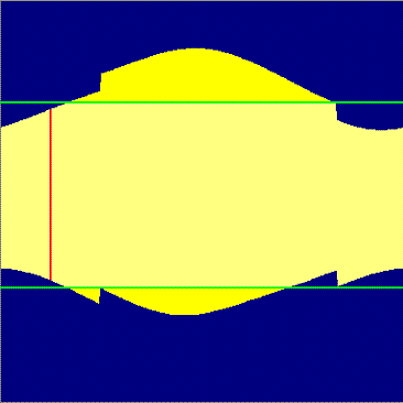
The yellow area represents daylight spread across a calendar year (January on the left, December on the right — that ridge that “jumps up” in the middle is the joyous miracle of Daylight Savings Time). The time of day runs up the Y-axis, midnight to midnight. So pretty.
For context, those green horizontal lines slice out a typical work day, the lower one being the time I get up, and the upper one the time I get home. Thus, the bright yellow sections below and above those green lines represent the times of year when I wake up and come home in daylight.
(Still here? Bless you.)
Payoff: That red vertical line approximates where we are right now — and every day, that line nudges a little to the right, ever closer to the big bulge of summer. See how close we are? So close.
And, ahem, “according to my calculations” (Werner! My lab coat and clipboard! Schnell! Schnell!), we will cross those green lines into the bright-yellow zone in…
beep boop beep boo-ching
Fourteen days. Hallelujah.
Disclaimer: Rain and clouds are not represented. To account for those, print graph and randomly splotch yellow area with gray, viscous material.


1 Comments:
Ah, spring, when a young man's fancy turns to Excel.
Post a Comment
<< Home